Overview
This guide explains how to create custom dashboards to visualize and analyze data tailored to your specific needs. Custom dashboards allow you to select data sources, choose visualizations, apply filters, and arrange tiles to track the metrics important to your business.
Understanding Data Sources (Explores)
Before creating a dashboard, it’s helpful to understand the available data sources:
LP Unified Data: Contains a comprehensive analysis of government contracting leads, including RFP details, budgets, geographic data, and AI-extracted insights. Use this to find opportunities, analyze trends, identify high-value leads, and understand market patterns.
Agency Analysis Dataset: Provides direct analysis of government agencies, including contact information, procurement websites, and organizational details.
Dimensions vs. Measures:
- Dimensions: Descriptive attributes such as Agency Name, City, State, Category, or Due Date. These are the “labels” or “groupings” for your data.
- Measures: Quantitative values such as Total Leads, Average Budget, or Lead Count. These are calculations or aggregations performed on your data.
Create a New Dashboard
Step 1: Access the Create Menu
- Open the side navigation menu.
- Click the Create button (plus icon).
- Select Dashboard from the dropdown menu.
A “Create dashboard” modal window will appear.

Figure 1: Create dashboard
Step 2: Configure Dashboard Settings
- Enter a descriptive name in the Dashboard Name field.
- Example: “California RFP Opportunities”
- Select a storage location from the Folders dropdown.
- My Folder: Saves the dashboard to your personal folder
- Users: Allows you to select folders shared with other users
- Click Create Dashboard.
The system will load an empty dashboard with the message “This dashboard is empty.”

Figure 2: Naming dashboard
Add Visualizations to Your Dashboard
Step 3: Enter Edit Mode
- Click the Edit Dashboard button.
The dashboard enters edit mode, displaying additional options in the top ribbon.

Figure 3: Edit dashboard
Step 4: Add Your First Tile
- Click the Add button in the top ribbon.
- Select Visualization from the dropdown menu.
A “Choose an Explore” modal window will appear.

Figure 4: Add Visualization
Step 5: Select a Data Source
- Review the available explores (data sources).
- Select LP Unified Data for lead and opportunity analysis.
- Example: Select LP Unified Data to analyze California RFP opportunities
- Click to confirm your selection.
The modal window changes to “Edit Tile” mode.

Figure 5: Selecting an Explore
Step 6: Configure the Tile
- Locate the Title field at the top of the Edit Tile window.
- Enter a descriptive title for this visualization.
- Example: “Top Agencies by Opportunity Count”
Select Fields for Your Visualization
The Edit Tile window is organized into three main sections:
- Fields (left panel): Available dimensions and measures
- Filters and Visualization: Filters, chart type and preview
- Data and Results: Selected fields and data output
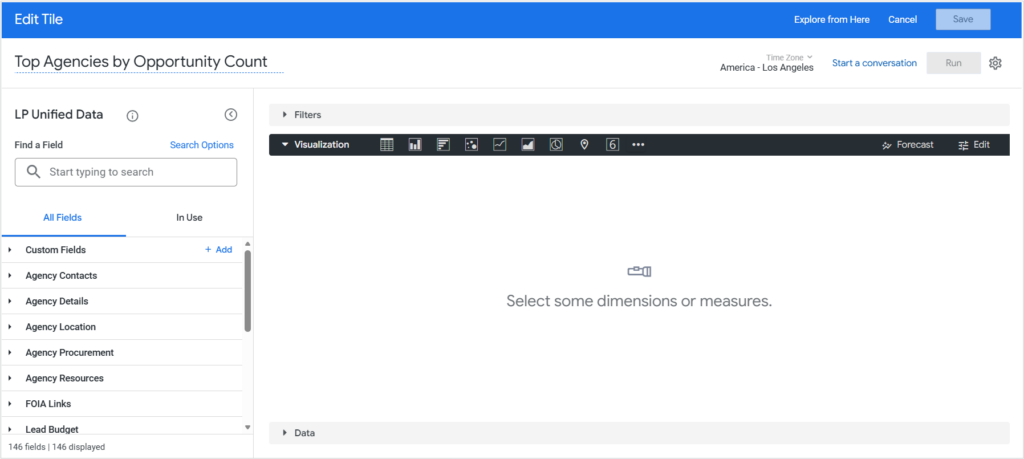
Figure 6: Edit Tile window
To add fields:
- Browse or search for fields in the left panel.
- Use the Search box to find specific fields
- Click Search Options to filter by field label, description, group label, or view label
- Click on a dimension to add it to your visualization.
- Example: Click “Agency Name” under Agency Details dimensions
- Click on a measure to add quantitative data.
- Example: Click “Total Leads” under Lead Activity measures
Selected fields will appear in the Results section on the right.
Note: Dimensions typically include text fields like names, locations, and categories, while measures include numeric calculations like counts, totals, and averages.

Figure 7: Adding fields and dimensions
Step 7: Choose a Visualization Type
- Locate the visualization type icons in the center panel:
- Table: Displays data in rows and columns
- Column: Vertical bar chart
- Bar: Horizontal bar chart
- Scatter: Scatter plot
- Line: Line chart
- Area: Area chart
- Pie: Pie chart
- Map: Geographic visualization
- Single Value: Displays a single metric
- Click a visualization icon to select it.
- Example: Select “Bar” to create a horizontal bar chart showing agencies
- Click the three-dot menu to access additional visualization types:
- Bar Gauge, Box Plot, Donut Multiples, Funnel, Sankey, Spider, and more
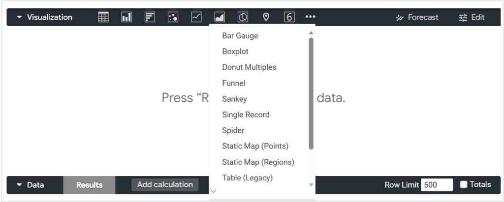
Figure 8: Available visualization types
Step 8: Apply Filters to Your Tile (Optional)
Filters allow you to refine the data displayed in a specific tile.
- Locate the Filters section in the Edit Tile window.
- Click the + (plus) icon to add a filter.
- An “Add Filter” modal window will appear.
- Select a field to filter (e.g., State, City, Category).
- Example: Select “State” from the dropdown
- Choose an operator (is, contains, starts with, etc.).
- Example: Select “is”
- Enter the filter value.
- Example: Enter “CA” for California
- Click Add to apply the filter.
- Repeat steps 2-7 to add additional filters if needed.
- Example: Add a second filter for “Due Date” is “in the next 90 days”
Note: You can create complex filter logic using AND/OR conditions by adding multiple filter expressions.

Figure 9: Applying Filters
Step 9: Run and Preview Your Visualization
- Click the Run button in the Edit Tile window.
- The system will display status messages: “Query Initialization → Running Query → Processing Results”.
- Review the visualization preview in the center panel.
- Review the data results in the Results section.
- Make adjustments to fields, visualization type, or filters as needed.
- Click Run again to refresh the preview.

Figure 10: Running query
Step 10: Save the Tile
- Review the tile configuration to ensure it meets your needs.
- Click Save in the Edit Tile window.
The tile will be added to your dashboard.

Figure 11: Saving tile
Add Dashboard-Level Filters
Dashboard-level filters allow users to dynamically filter all tiles on the dashboard at runtime.
Step 11: Add Filters to the Dashboard
- Ensure you are in edit mode (if not, click Edit Dashboard).
- Click the Filters button in the top ribbon.
- An “Add Filter” modal window will appear, displaying all available fields from your data sources.
- Select the fields you want to make available as filters.
- Example: Select “Agency Name” and “City”
- Click Add for each filter.
- The filters will appear at the top of your dashboard (or in the right sidebar, depending on settings).

Figure 12: Applying dashboard filters
Note: Dashboard-level filters differ from tile-level filters. Dashboard-level filters can be adjusted by users viewing the dashboard, while tile-level filters are fixed within each tile’s configuration.
Add Additional Tiles
Step 12: Create More Visualizations
- Click the Add button in the top ribbon.
- Select Visualization.
- Repeat Steps 5-10 to create additional tiles.
- Example: Add a second tile showing “Budget Distribution by Category” using a scatterplot
Tip: Create multiple tiles to provide different perspectives on your data, such as trends over time, geographic distribution, or category breakdowns.
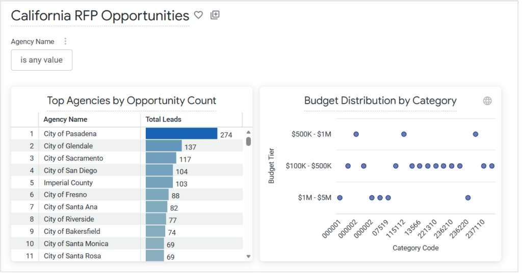
Figure 13: Custom dashboard
Step 13: Arrange Tiles on Your Dashboard
- Click and hold a tile to drag it.
- Move the tile to your desired position.
- Release to drop the tile in place.
- Repeat for other tiles to organize your dashboard layout.
Step 14: Adjust Dashboard Layout
- Click the Quick layout button in the top ribbon.
- Select a layout option:
- Extra Small: 6 tiles across
- Small: 4 tiles across
- Medium: 3 tiles across
- Large: 2 tiles across
- Extra Large: 1 tile across
- The dashboard will adjust tile sizing based on your selection.
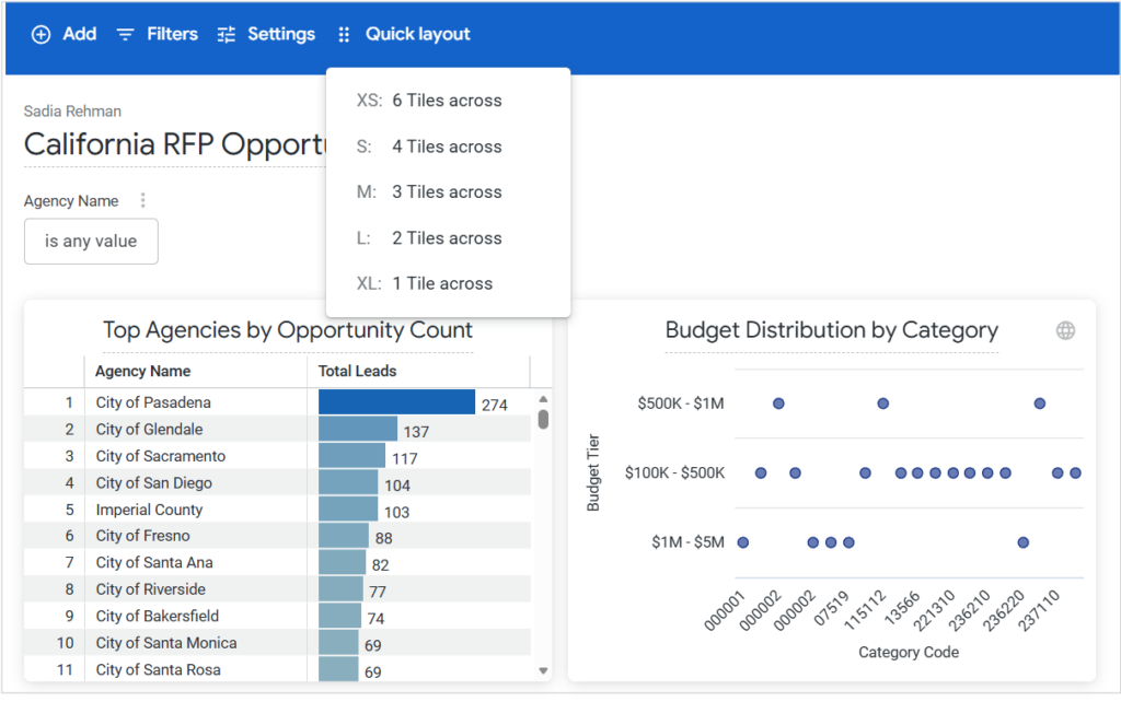
Figure 14: Quick layout options
Configure Dashboard Settings
Step 15: Access Dashboard Settings
- Click the Settings button in the top ribbon.
- A “Settings” modal window will appear with two tabs: General and Filters.
General Tab
Configure the following options:
Time Zone
- Select Each Tile’s Time Zone or choose a specific time zone from the dropdown.
Run on Load
- Toggle ON to automatically run all queries when the dashboard loads.
- Toggle OFF to require manual execution.
Allow Full Screen Mode
- Toggle ON to enable full-screen viewing of individual visualizations.
Automatically Refresh Dashboard
- Toggle ON to enable automatic dashboard refresh.
Refresh Tiles
- Set the refresh frequency:
- Select Refresh Every from the dropdown.
- Enter a number in the frequency field.
- Select the time unit (seconds, minutes, hours, days).
- Example: Set to “5 minutes” to refresh the dashboard every 5 minutes
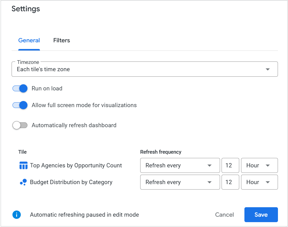
Figure 15: Custom dashboard Settings
Filters Tab
Configure filter display settings:
Default Filters View
- Expanded: Filter bar is visible on page load
- Collapsed: Filter bar is hidden on page load, but can be opened
Filters Location
- Top: Filters are displayed above dashboard tiles
- Right: Filters are displayed in the right sidebar
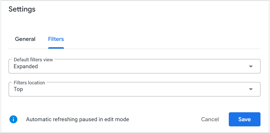
Figure 16: Filters Settings
Step 16: Save Settings
- Review all settings.
- Click Save in the Settings modal window.
Save Your Dashboard
Step 17: Exit Edit Mode and Save
- Review all tiles, filters, and layout.
- Click Save in the top ribbon to save all changes.
- The dashboard exits edit mode and is now ready to use.
Your custom dashboard is now accessible from your selected folder location.

Figure 17: Saving dashboard
Edit an Existing Dashboard
Step 18: Return to Edit Mode
- Navigate to your dashboard.
- Click the three-dot menu in the top-right corner.
- Select Edit Dashboard from the dropdown.

Figure 18: Editing dashboard
- Make desired changes to tiles, filters, or settings.
- Click Save to apply changes.
Note: For advanced platform-level details on dashboard creation, refer to Looker: Creating user-defined dashboards.
FAQs
What’s the difference between tile-level and dashboard-level filters?
Tile-level filters are fixed within a specific visualization and cannot be changed by users viewing the dashboard. Dashboard-level filters appear at the top or side of the dashboard and can be adjusted by users to dynamically filter all tiles.
Can I use multiple data sources in one dashboard?
Yes, different tiles on the same dashboard can use different data sources (explores). Simply select the appropriate explore when creating each tile.
How do I share my custom dashboard with others?
Save your dashboard to a shared folder location when creating it, or move it to a shared folder after creation. You can also use the “Get link” option from the dashboard actions menu.
Can I edit a tile after saving it to the dashboard?
Yes, enter edit mode, click on the tile you want to modify, make your changes, and save.
Can I duplicate an existing tile?
Yes, in edit mode, click the three-dot menu on a tile and select “Duplicate tile” to duplicate it. You can then modify the copy as needed.
Contact Us
For further assistance, Contact Us.