Overview
This guide provides an overview of the default Leads Dashboard in Lead Pursuits. It explains the data, tables, and visualizations available on the dashboard, and how they help users review and analyze procurement leads.
Dashboard Filters
At the top of the dashboard, users can apply filters to refine the data shown across all tables and visualizations.
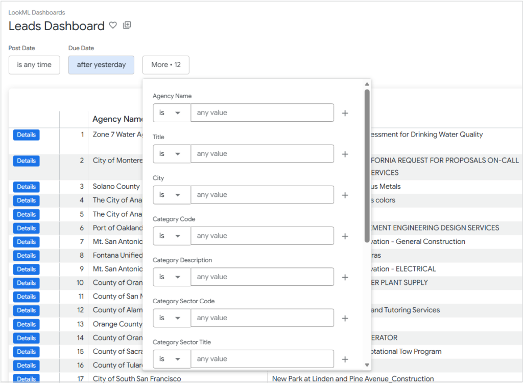
Figure 1: Lead Filters
Available filters include:
- Post Date
- Due Date
- Agency Name
- Title
- City
- Category Code
- Category Description
- Category Sector Code
- Category Sector Title
- Project Scopes
- Quality Indicators
- Document Terms
- ZIP Code
- Proximity (miles from ZIP Code)
These filters control which leads are included in the dashboard results. Once filters are selected and the query is run, all visualizations update to reflect the filtered dataset.
Note: For detailed guidance on applying filters and using operators effectively, refer to Filtering Leads Effectively.
Leads Table
The Leads table is the primary results table displayed at the top of the dashboard. It lists individual opportunities that match the applied filters.
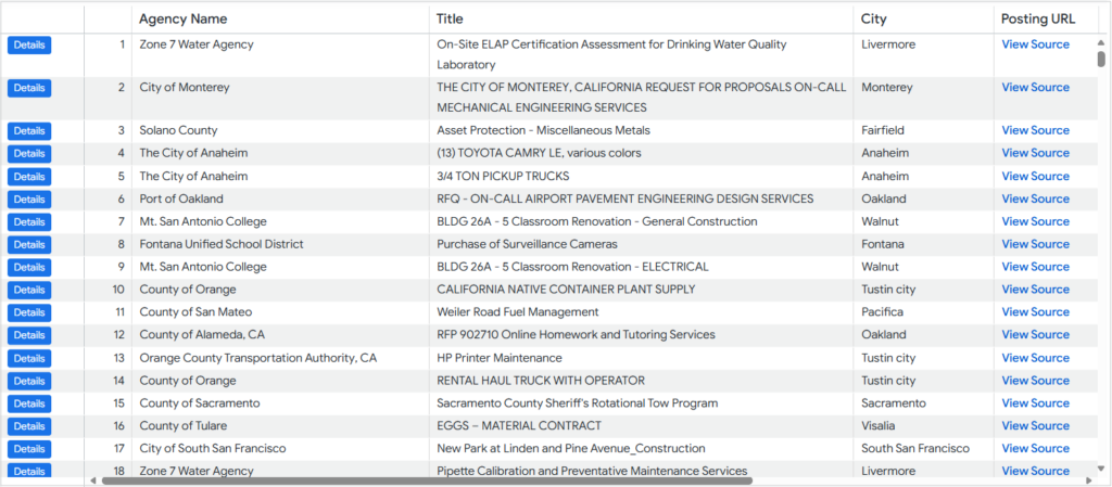
Figure 2: Leads table
The table includes the following columns:
- Agency Name
- Title
- City
- Posting URL
- Posted Date
- Due Date
- Days Until Due
- Response Window (Days)
The Posting URL column provides a direct link to the official source of the opportunity posting.
Note: Clicking the Details button next to each lead opens the Lead Details dashboard, which displays the details of the chosen lead. (See: Understanding Lead Details Dashboard)
Sorting and Column Options
Columns in the Leads table can be sorted in ascending or descending order by clicking the column header.
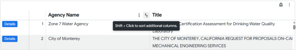
Figure 3: Sorting columns
Each column header also includes a column options menu (three-dot icon), which allows users to:
- Freeze columns
- Copy column Values
- Auto-size All Columns
- Reset All Column Widths
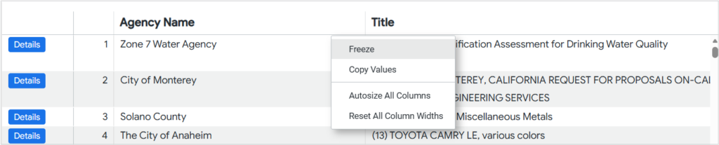
Figure 4: Column options
Table Actions
Additional actions are available from the visualization-level menu (three-dot icon in the visualization header):
- Auto-size all columns
- Reset all column widths
- View
- Expanded
- Full screen
For more details on tile actions and dashboard interactions, see Looker: Viewing dashboards .
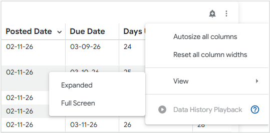
Figure 5: Table options
Alerts
A bell icon is available on the visualizations, allowing users to configure alerts based on numeric measures.
For step-by-step instructions, refer to Setting Up Alerts.
Agencies Visualization
The Agencies visualization displays a table showing:
- Agency Name
- Lead Count per agency
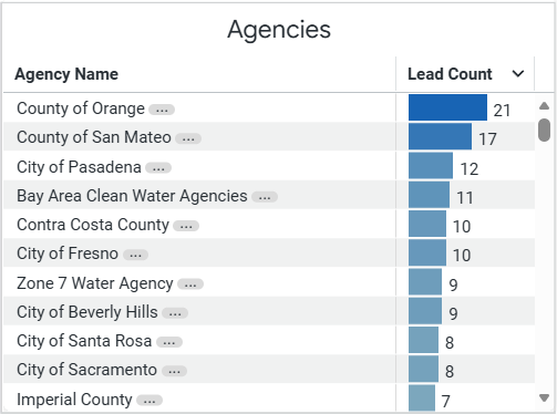
Figure 6: Agencies table
This view highlights which agencies have the highest number of matching leads in the filtered lead set.
Categories Visualization
The Categories visualization provides a breakdown of leads by category, including:
- Standard
- Code
- Description
- Sector Code
- Sector Title
- Total Leads
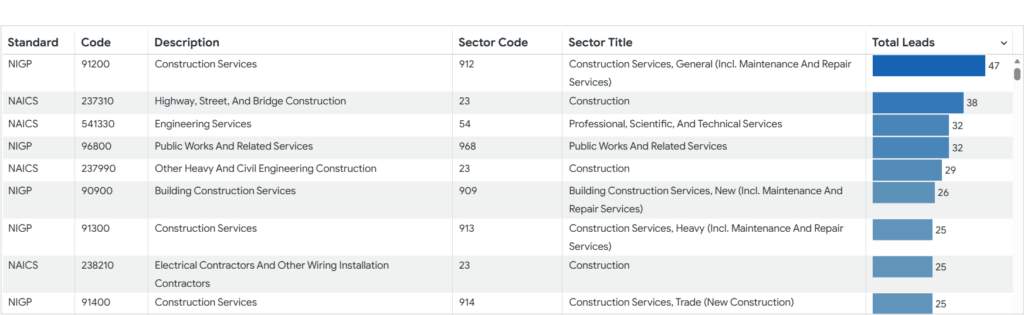
Figure 7: Categories table
This view helps users understand the types of work represented in the current filtered dataset and identify categories with the highest opportunity volume.
This chart helps users quickly assess how opportunities are distributed across procurement formats.
Lead Locations Map
The Lead Locations Map visualizes the geographic distribution of leads based on the filtered results.
- Each orange marker represents a lead location.
- Hovering over a marker displays:
- Agency Name
- Lead Title
- Distance from the searched ZIP Code (miles)
- Posted Date
Standard map controls are also available, including zooming and panning.
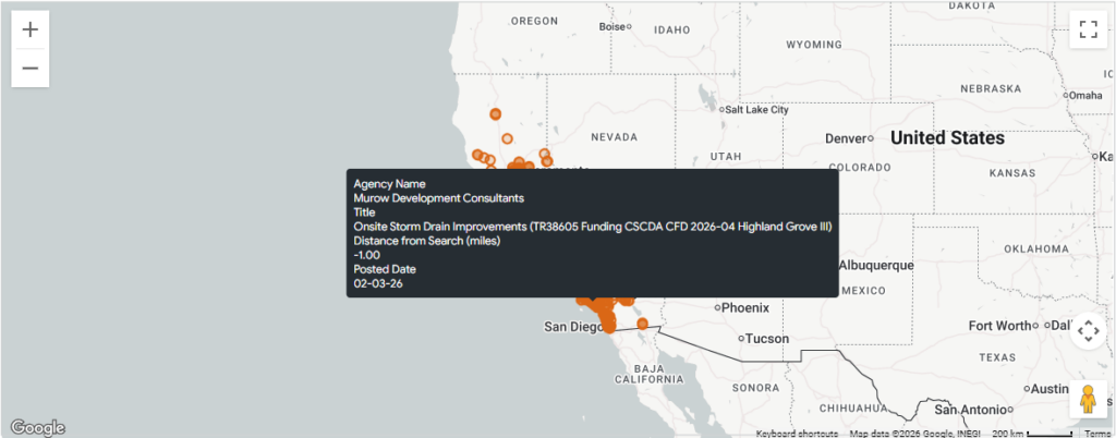
Figure 8: Lead location map
This visualization is particularly useful for identifying regional opportunities and assessing proximity-based relevance.
Contact Us
For further assistance, Contact Us.